Meta has recently unveiled an update to its Facebook “identity system,” which notably features a refreshed logo. Well, not exactly a dramatic overhaul – the changes are rather subtle. The primary alteration involves a darker shade of blue, and if you look closely, you’ll notice a few subtle tweaks to the lowercase “f.” You can compare the new logo with the previous one in the image provided at the top of this post.
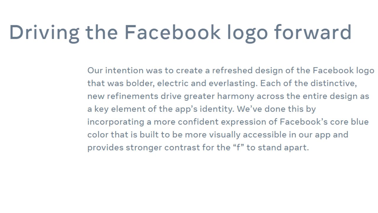
In a blog post released on Wednesday, Meta provided an explanation for these modifications.

I must admit, the phrase “a more confident expression of Facebook’s core blue color” does seem like quite a mouthful just to describe a slightly darker shade of blue for the logo!
All jokes aside, it’s quite understandable why Meta has chosen to make only minor adjustments to the Facebook logo rather than completely revamping it. After all, with a staggering 2 billion daily active users, any visual alteration will be seen by an enormous audience. It makes sense to tread lightly when dealing with one of the most instantly recognizable logos in the tech world.
Read More: iPhone 15 Global Launch
For those feeling a touch nostalgic, Meta’s blog post even included a brief video showcasing the logo’s evolution, which I’ve transformed into a GIF for your viewing pleasure.
The changes don’t stop at the logo alone; Meta’s blog post also mentions an update to the Facebook wordmark. According to the post, they’ve employed their custom typeface, known as “Facebook Sans,” to give the wordmark a facelift. The aim here is to ensure a consistent treatment and enhance overall legibility across the platform. Meta states, “Similar to the changes made to the logo symbol, these refinements allow us to build upon our identity’s heritage while establishing a stronger visual connection between the wordmark and the rest of the typeface.”
Read Also: Facebook Touch
In addition to the logo and wordmark updates, there’s also a fresh color palette to take note of, and, surprisingly, it’s heavy on the blue spectrum. Meta has put some effort into refining the appearance of Reactions as well. They explained, “By expanding our color palette, we’ve managed to infuse more depth and emotion into Reactions. We’ve fine-tuned the colors to align with accessibility guidelines, ensuring that our icons remain legible regardless of their size. This makes them adaptable for various purposes and ensures a user-friendly interaction for people.”
Meta isn’t stopping with these initial updates to Facebook’s appearance. In fact, the company has labeled the changes outlined in Wednesday’s blog as just the beginning of a larger overhaul for the app’s identity. So, it’s worth staying tuned for more design adjustments on the horizon.
